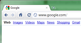
The Google Chrome team are in the process of implementing some changes to the user interface, in the aim of streamlining the toolbar.
Changes include displaying either a magnifying glass, or a globe icon in the URL bar to help determine what the browser is doing with the user input. Secure sites will now display the padlock icon at the start of the URL, rather than at the end of the URL bar.
Reasons for the changes, and a list of other planed changes can be seen on the Chromium blog.
These changes are starting to make their way into Chrome Dev Builds.


